The way we navigate in the digital age or how to avoid being another ship wreck.
Sometimes I think we forget just how lucky we are to be navigating in the digital age. We haven’t always had so much choice for positioning and displaying our position. Watch keeping has been made easier with GPS, AIS, HD RADAR’s and even voyage data recorders. The Global Navigation Satellite System receivers are good enough to place you with reasonable precision and some modern RADAR units are now good enough to pick up bamboo poles and little wood canoes. AIS is a great tool to display ships, beacons and lights as we travel the seas and oceans. Both RADAR and AIS have the ability to easily confirm the yacht position that's plotted on the chart.
 |
| AIS can certainly help in congested waterways. Beware not to get overwhelmed with the amount of data. Instrument or chartplotter adjustments can limit the amount of information displayed to help overcome the creation of a data overloaded situation. |
Forecasting of Weather
Another major advance in ship safety is the forecasting of weather. It doesn’t seem all that long ago that those with very deep pockets had a weather fax. However, for the rest of us we would listen to the radio or buy the newspaper to get the latest forecast before we set sail. We now have a multitude of sources to get weather forecasts. We can download weather faxes on the HF or receive them via email or down load them from the internet. GRIB files can be downloaded from several sources. We would get GRIB files over Sailmail on the HF or download from the internet when closer to shore. Other cruisers we sailed with would use their sat phones and get forecasts including downloading GRIB files.
 |
| Nice GRIB file display, up to a weeks forecast at our finger tips any time of the day. GRIB file collected and displayed on zyGRIB part of OpenPlotter package running on a Raspberry Pi. We are able to select local time to display the information so we don't need to convert UTC to local which becomes tiring after a while. |
Data Overload
The only drawback, if there is one, to the many advances and abundant information from a variety of sources is how we use the information. Beware, don’t follow the data blindly, as we have found there is still interpretation and analysis to be done. However we have also found some get so caught up in information collection they get an over load and neglect to do the analysis when confronted by so much data. If your chart starts to look too overloaded with objects here is a description of hotkeys to remove clutter quickly.
Its a process of elimination
Keep it simple and find through a process of elimination the tools that suite you the best. When we went offshore we were offered a lot of data files with information of the places we intended to visit. While in the beginning this seemed like a fantastic windfall, then as we started to sift through the info we found is was difficult to correlate some of the conflicting information. We would hear that one place was absolutely fantastic and then the next guide we would read to steer clear. So sort your data carefully and remember things change and any info over six to seven years may be questionable. Some things don't change but there is an enormous flexible area in between.
We will discuss some we use, and the ways to cross check available data. We have even noticed some of the big instrument makers are adding more and more features all the time that can cause confusion. Unfortunately we already have a lot of Nintendo sailors out there. Yep its a term in use now days that describes the sailors who look at the screen more than out to the horizon. While the screens do carry a fantastic assortment of information, managing the vessel on a voyage with your head down looking at a monitor is a good way to become a statistic.
False Sense of Security
We talked with some cruisers recently that believed the precision of their electronic charts were so good that they were accurate to within a few metres. Wouldn’t this be good to have charts as accurate as the position output from the GNSS receiver connected to the chartplotter? Unfortunately this isn’t the case. A lot of the time I presume, due to ignorance, some would not hear a cautionary word spoken and really why would they need to be careful when using commercially produced electronic charts? large ships do. The answer to large ships using electronic charts with reasonable confidence is, that they steam down very well used sea lanes into busy ports that are consistently being surveyed for obstructions and navigational hazards. The large ships are not venturing off the sea lanes into poorly charted areas, as most cruising vessels do.
 |
| An electronic chart segment not referenced to WGS 84. Datum unknown and the vessels were positioned by GPS. The chart does contain good information though, range and bearing info can give you an idea of how far to offset the vessel position on the chart so as to use the depth information or avoid upcoming obstacles. |
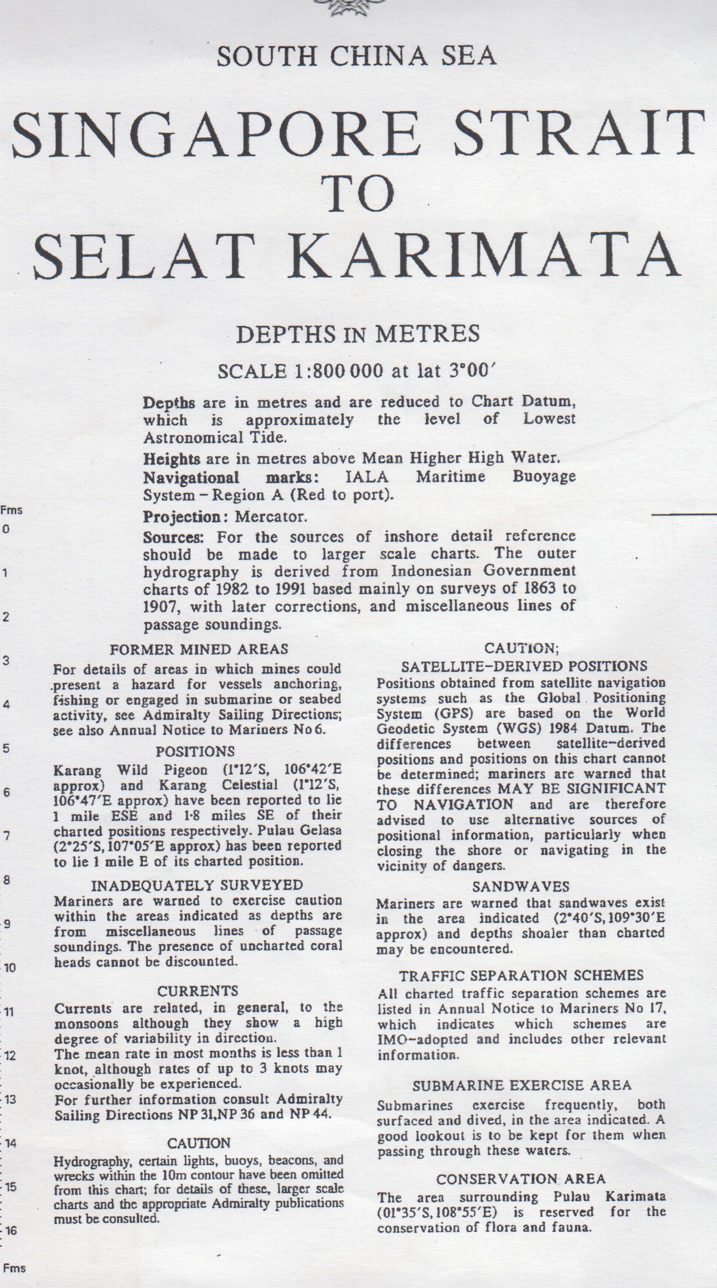
As an example of how dangerous this false sense of security can be, when passage planning we start work by checking our intended passage on the chartplotter. Some of the time we will find that the electronic chart will state plainly that satellite positions obtained using WGS 84 datum cannot be plotted on this chart. For those not familiar with the term WGS 84, it means the datum used to calculate a position solution of modern GPS satellites. We have also seen the same area displayed with all its hazards by a different brand of electronic chart, with out the caution.
 |
| The small print on the chart states that the chart cannot accurately be referenced to WGS84 Datum, with out a reference point or datum, extreme care is needed to navigate in this area if your using GPS as a positioning source. |
 |
| Passage planning comparing various sources of information. |
Charts Not Totally Suitable for Pilotage
While our travels progressed and we ventured to places favoured more by fishermen and cruisers than commercial marine traffic we began to see more and more chart abnormalities.
We have been cruising in a lot of remote tropical and semi tropical regions for the last ten years and I will admit that at times it has been interesting, especially where the charts were not totally suitable for pilotage. That’s not to say there were not any official charts of the areas we were in, often the charts that do exist are old, well in other words haven’t been updated and reprinted with new survey data. Or there may not have been any hydrographic surveys done for years. Additionally, but to a lesser extent, some of the older local datum may have carried over into recent revisions of the charts. Then it is carried forward again as the paper charts were digitised into the apparently modern electronic ones. The differences can occasionally be hundreds of metres.
 |
| Older paper chart, info box chart datum isn't specific. GPS positions cannot be plotted on this chart. Note the positions of the reefs and island being reported to be out of position to the chart. |
 |
| Electronic chart with the reefs in the same place noted as being out of place on the paper chart. On closer inspection of this electronic chart, it appeared to be a pretty copy of the paper chart that can not have GPS (WGS 84 Datum) positions plotted on. Another brand of electronic chart did list the fact that satellite positions could not be plotted on the chart in the lower layers. |
We always have one or at times two people on lookout when needed. The RADAR is ready to provide range and bearing measurements. Keep in mind RADAR range measurements can be accurate, use two or three ranges to obtain a fix. The same cannot be said for bearing measurements as the average RADAR beam is 5 degrees or more. The image on the screen may seem stretched and because of this, making an exact bearing measurement can be difficult. As with every tool, calibration is important, making sure the angles and ranges that are displayed are correct before heading off on a passage.
 |
| Time to get on the bow when closing on an entrance |
Sailing Directions and Planning Guides
When spending time planning our route and ensuring we didn’t see any obstructions on the chart along the way. We made good use of the sailing directions and planning guides put out by the U.S. NATIONAL GEO SPATIAL-INTELLIGENCE AGENCY. Sailing Directions (Planning Guides) include relevant physical, political, industrial, navigational and regulatory information about the countries adjacent to a particular ocean basin in a single volume.
From experience the most challenging charts are the ones that lack any fine detail. To cover this lack of data we have found chart makers have marked these areas as shallows or very shallow, even though there is in a lot cases navigable water depth. Even with the newer charts, in a lot of cases the charts do not have sufficient detail to allow yachts and smaller vessels to easily venture out of the shipping lanes or major ports to explore and find safe anchorages.
 |
| Electronic chart showing limited detail, lagoon depth info not existent. |
 |
| Satellite photo chart adds enough detail to allow us to find a protected anchorage over night. |
 |
| Nice anchorage for the evening. |
To keep things interesting, in the warmer tropical waters, coral can grow at a surprisingly alarming rate when the conditions are right. What was a clear channel when charted 100 years ago or for that matter even 25 years ago might now have coral bommies close enough to the surface to catch the average cruising yachts keel.
 |
| Getting from here to there is going to need all eyes on deck, and good satellite photo charts. |
Several Ship Wrecks
Some charts we have encountered list that the depths are not from recent surveys but from single transit lines and there was no reference to when or the vessel type, depth sounder or lead line. But I guess in the long run the message is clear, coral heads and obstructions may well exist, missed by the vessels on a transit. If you notice on the chart several ship wrecks scattered about in a small area of supposed open water be careful, even to the point of having crew posted on the bow as look out. Why did these ships sink? They more than likely hit something not charted in the area, then steamed on until loosing the battle with the incoming water they sank.
ABC of Passage Planning
The cruising skipper/navigator needs to piece together every available bit of information in advance, and for us, satellite imagery as an additional navigation aide has proven to be successful. Even before we left Australia and were exploring the east coast we adopted a range of techniques to supplement standard navigation and pilotage practices. We started to use the freely available satellite imagery to fill in the gaps and give us the support to explore and make safe passages even when going off the beaten track. One rule we follow now days is the A.B.C of passage planning: Assume nothing, Believe nothing, and Check every thing...
 |
| Chart of a reef on the left is missing detail, the same area on the right satellite photo showing the real extent of the reef , and while not marked on the chart there are large metal tower beacons on both sides on the edge of the coral marking the channel between the reefs |
We now make navigation safer using satellite images
The availability of satellite imagery for us while passage planning and navigating is a huge jump forward. It has allowed us to explore with acceptable confidence. Due to the additional information satellite imagery provides we can usually find safe alternatives when plan ‘A’ doesn’t pan out as we would have liked. Unfortunately some think this imagery is available in different platforms and can be used as a standalone tool, but it can’t and is really only an additional tool, however it has proven to be a very good one. In reality the use of satellite imagery does not replace traditional methods of navigation and pilotage, it enhances it.
 |
| Waypoint for anchorage plotted on standard electronic chart, not a lot of detail. |
 |
| The same waypoint plotted on a satellite photo chart. More detail of the surrounding area, and clear vision of the fringing reef. |
When we are given waypoints or find them published in anchoring/cruising guides we always plot them on the chart and satellite images. Experience has taught us to now treat every piece of information given to us with caution, especially when there appears to be some form of ambiguity. As an example we were given a list of waypoints for various anchorages in less travelled parts. What wasn’t making sense was the names of the islands were not what we were seeing on our charts. As it turns out the waypoints originally came from a European vessel. The spelling of the island names were different on their charts. We usually find the biggest challenge is to extract clear fact. On several occasions we have found serious errors that would have lead us into danger. We quickly found that satellite imagery will, in a lot of incidents provide weighty evidence to support the final evaluation.
 |
| Waypoints plotted on an electronic chart, the anchorage waypoints look ok with reasonable protection when plotted on an electronic chart. |
 |
| The same waypoints plotted on a satellite photo chart referenced to WGS 84 datum. The anchorage waypoints certainly have lost their appeal, and one is high and dry. Who really knows where the author anchored. |
Here is an example of the quality of some of the guides or information we have been given. We head for a waypoint and the reported depth is 6 - 8 metres in sand. When at the waypoint it’s over 20 metres deep. A quick search of the area for the reported depth proves fruitless and in frustration not wanting to be in total darkness when we finish for the day, we drop the anchor to find it grinds on coral. Sadly we found this will not be an isolated incident. We have also been given waypoints where the fine detail is missing and the waypoints are only in the vicinity waypoint. Where the author actually anchored will require detective work. We like to do the detective work before getting there, saves frustration at the end of a day’s travel.
 |
| Not what you want to see when picking up the anchor. |
Check the Geodetic Datum
Please remember before sharing waypoints check the geodetic datum used while collecting the data. Publish the results with the waypoints so corrections if needed can be applied before use. Please don’t pull out a paper chart with unknown datum a week later and say with confidence we anchored here and pin point the place on the paper chart where you think you anchored. Keep a log and actually read off the position from your GPS/GNSS receiver when the anchor is down. While this may sound crazy, check your satellite receiver regularly. On a number of occasions we have been given waypoints that when plotted would suggest a different receiver datum was mistakenly used and not WGS84, or as I said earlier it was wild guess work after leaving the anchorage. Either that or they had an air cushioned vessel flying over reefs, or anchored their deep keel yacht in less than a metre of water, somehow I don’t think either is true.
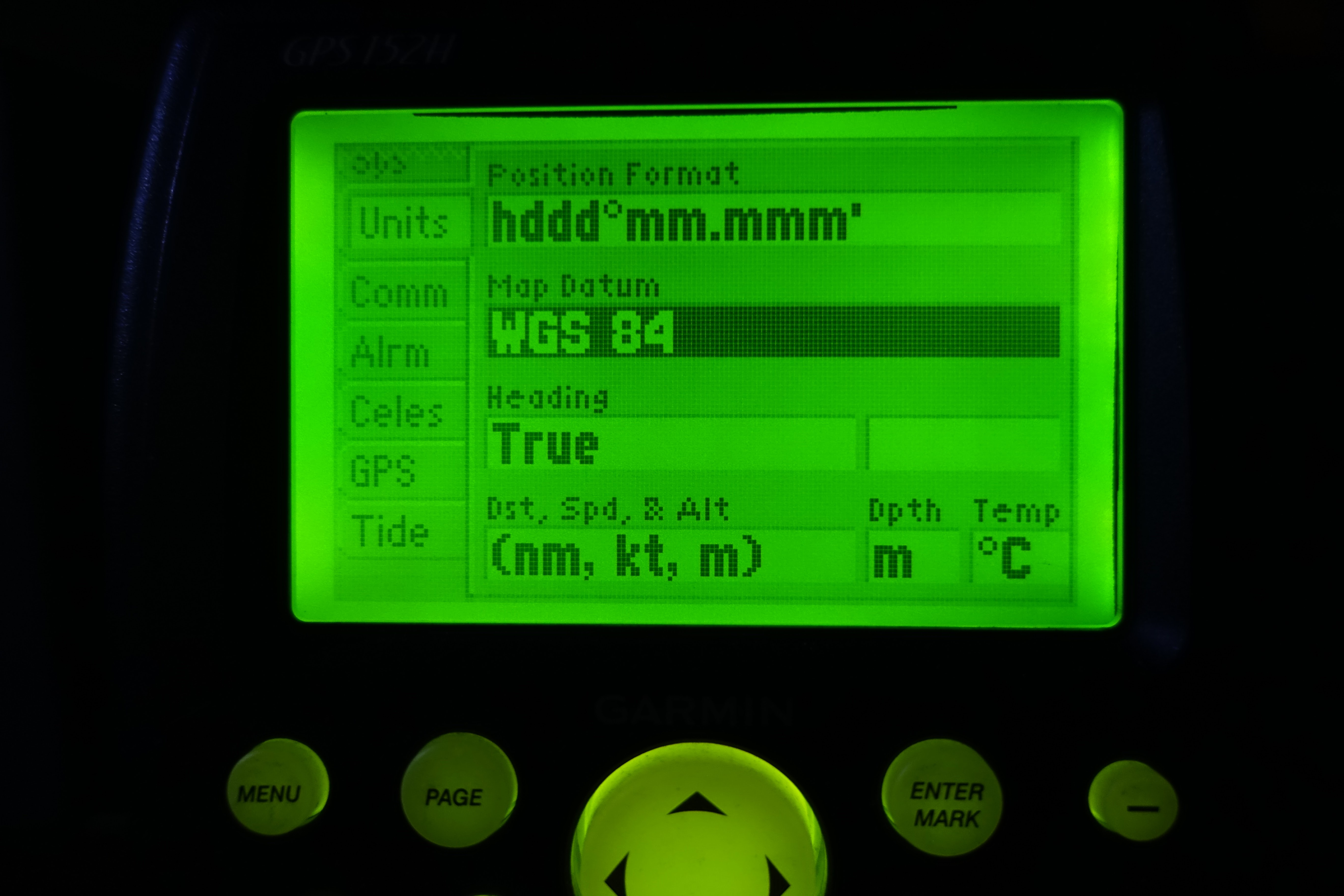 |
| This is an easy check to do on the chartplotter or GNSS receiver. |
Most people will be familiar with using satellite photos to explore. Coverage extends over most coastal waters and details most of the shoals, reefs and rocks. However, there are patches of the shore line and islands that are not shown due to the cloaking in what should be the offshore areas. This removes detail from areas where it has been determined it does not need to be shown and more than likely reduces download data. These areas including island/reefs/rocks not shown are usually due to being misplaced on the “Official Charts”. In the same area the reverse may be true and areas are uncloaked on the satellite imagery will contain no island/reefs/rock hazard. In this case extreme caution needs to be used when navigating in these areas, as you will find a hazard on the official chart that is not in the correct charted location. Or more to the point, the chart datum used for the position of the obstacle possibly had inaccuracies. Using a different program (SASplanet for us) that is connected to other satellite image resources may show the hazard, and the position of it can be found.
 |
| Satellite photo showing cloaked details. The positions used to uncloak the position where the island was charted as being, was most likely from a chart that was not referenced to satellite positions. So the opening in the cloak is not over the island which needs extra care to be taken when in the area |
 |
| Different source of satellite photo data showing islands, cloaking isn't noticeable on this shot |
In all but the most heavily polluted waters or areas near a large muddy river it is clear enough for shallow areas to be visible on satellite imagery. Even in slightly murky water as in the Malacca Strait, irregular discoloured patches can be distinguished. Due to the way the satellite images are compiled they can easily be referenced to WGS84 for plotting GPS positions on them. These features combine to provide a powerful tool to supplement traditional navigation and pilotage.
What technology tools do we use on board?
Windows 10/11 running on a laptop
SAS Planet which allows selectable satellite image resources
Raspberry Pi with OpenPlotter image, OpenCPN, satellite imagery overlay charts and various soft tools
Laptop running OpenCPN with Satellite Imagery overlay charts as well as a plug-in to display Google Earth directly from the web or from the cache on the hard drive.
OpenCPN also is great for displaying GRIB files and we set it up to read local time, so we don't continually need to calculate UTC to local.
Raymarine Chartplotter running Navionics electronic charts
SAT2CHART software for creating satellite image charts
GERoute to collect satellite imagery into the Google Earth cache
Various software to manipulate, edit, repair (GPX) GPS files (tracks, routes, waypoints)
Tide and current prediction programs, WXTIDE32, OpenCPN, Total Tide,
Hardware:
HD RADAR, we use this to tie in local features to the cockpit chart plotter. In a lot of cases we can gauge just how far land masses are offset on the charted WGS84 datum. We can also use it to do range and bearing fixes to plot our position. We also use it to accurately measure vessel distance from other vessels or obstacles when anchoring.
Wi-Fi access point, NMEA positioning data is transmitted ship wide over a Wi-Fi Access Point (AP)
Android Tablet running Navionics charts (Position data is from an internal GPS receiver or via Wi-Fi)
Garmin GPS 73 handheld
Hand bearing compasses
Laptop running Windows 10/11, Raspberry Pi 4 with OpenPlotter image
As listed earlier in our navigation station we have a Raspberry Pi with OpenPlotter image, positioning data is supplied by a connected GNSS (Global Navigation Satellite System: e.g. GPS, GLONASS, QZSS) receiver. Reception is very good due to the external antenna. As a backup we also have a USB port powered GNSS receiver dongle. Reception is good enough from its location behind the chart table, although this might not be the case on all boats, due to deck and hull construction material or methods. I use a laptop with Windows 11 because it’s a stable common platform for all the various, charting, navigation, tide, file creation, editing and conversion software we use.
The laptop and peripherals are charged by DC/DC power adaptors so we can conserve power and we do not need to run an inverter. This laptop uses a NMEA positioning data feed off the vessels Raymarine active GPS antenna, which is networked electrically as well as wireless (Wi-Fi) throughout the vessel and supplies positioning data to the cockpit chartplotter. We run OpenCPN on both the Raspberry Pi and the laptop, this avoids compatibility problems when exchanging self-created files between the two systems and with other cruisers. Here is a short article we did on power basics.
 |
| DC power supplies to run the laptop, we got this lot on eBay the first ones we had were from a computer shop, a little more expensive though. The biggest problem when sourcing these adapters is finding the right sales person who understands you want 12volt DC power supply with the correct voltage output for your laptop. Also keep in mind 12 volt USB chargers for phones and a lot of small electronics are available from most car part shops or online through eBay or Amazon |
 |
| 12 Volt to USB adaptors and a unit that can be hardwired into the ships nav station. |
I would like to mention that with this push to Wi-Fi connectivity there appears to have a weak link, being electrical storm activity. We have experienced this several times, at the height of the storm we lost Wi-Fi inter-connectivity, which was very inconvenient at the time. So to counteract this we don’t use wireless connections on critical systems and if we do, we have a hard wired backup system.
 |
| Part of the nav station, Bolt 4G modem (upper right) powered by USB adaptor. External antenna can be connected in marginal reception areas. Centre screen is the OpenPlotter set up running on a Raspberry Pi, connecting to the 4G modem via Wi-Fi allows downloads of GRIB files. GRIB file on display here using zyGRIB |
We try and maintain 4G access to the internet to download the images on the go. We have a dedicated 4G mobile modem router with external antenna, or we can use the mobile phone as a hot-spot (tether) for the laptop and Raspberry Pi. In some parts of Australia and Asia (Malaysia, Thailand, Indonesia) when close to the coast the coverage is good enough to allow file/satellite imagery downloads as you travel along. However, I really cannot recommend this in case you encounter a blind spot and loose coverage. Normally, we passage plan ahead for the areas of satellite imagery coverage needed and download when we can. When headed into the more remote parts of Australia and Asia we have had to plan up to a month in advance and collect satellite imagery while we have had a good internet connection.
 |
| Raspberry Pi acting as and access point, allows sharing data between devices. As shown a tablet, phone and the main screen. The raspberry Pi has an access point and is also connected to the 4G modem allowing the connected screens to access the internet as well as display navigations data. The navigation can be a clone of the main screen or you can use another charting program like Navionics. |
Google Earth Cache
Google Earth can be run live streaming from the internet or it caches (automatically saves) viewed imagery up to a user selectable pre-set storage size limit. You can adjust and make the most of this cache size in the program settings (Tools/Options, Cache tab). In more remote areas you will need to prepare all your satellite image charts in advance. During the planning stage of your trip while you have a good internet connection, traverse a planned route zooming in and panning as you go along. The detail saved (cached) is automatically adjusted as you zoom.
 |
| Google earth setting up the cache limit for memory and disk. |
You can even explore archived images from previous years to find the clearest pictures. This is not an option when using SASplanet so keep this option in mind if you have trouble finding a recent clear satellite photo.
Provided you don’t exceed the pre-selected storage limit, all the images will be available later when you are under way and not connected to the internet. The setting to have the archive selection tool visible is in the settings tab (View, Historical Imagery).
If you’re thinking it’s going to get tedious sitting and moving the curser over a pre-set route to collect a cache of Google Earth satellite images, you can breathe a sigh of relief, a program called GERoute is available as a free down load and is written specifically to follow a route to load up the Google Earth cache. Link is supplied in the resources.
You can connect a GPS to Google Earth, (Tools, GPS tab) we use a USB GNSS dongle. Your boat location will be shown on the satellite imagery in Google Earth. I know it does work and have tested it, but have never used this option stand alone.
Note: About the use of Google Earth caches. At the start of the journey or during passage planning, if you’re anchored at a major town the internet connection is fast and secure. If you use the caching method saving imagery for later use, my suggestion is that once you have collected the data turn off the internet connection for that device you have cached the images on (laptop). Then when on passage and you have Google Earth open, keep the connection off, this saves the imagery database (cache) from being corrupted by being over written. With no internet connection to the laptop the Google Earth cache is not over written. The program will complain about not having a connection when first opened but will run using cached data.
OpenCPN displays
OpenCPN is a concise and robust open source chart plotting software that is freely available for download. It is the product of an online community of volunteer programmers. Electronic charts can be displayed and overlaid with waypoints, routes and tracks. Also available for download is a whole range of additional plugins that add a versatile range of functionality. One of these plugins is a Google Earth display, this allows an additional window on the OpenCPN screen, on one will be displayed Google Earth imagery and on the other will be the electronic chart. The boat position will be shown on both mediums on the screen.
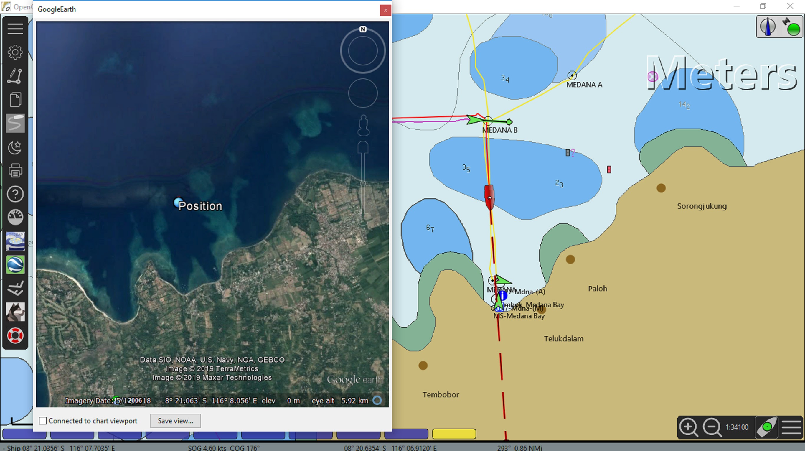 |
| OpenCPN display, Google Earth plugin running to display a satellite photo and the boats position. Google earth can be using cache files or a live internet feed. |
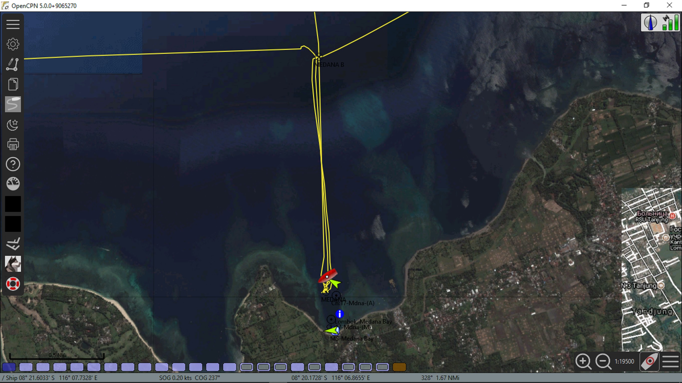 |
| Satellite photo chart referenced to WGS 84, display is overlaid on the electronic chart. |
 |
| OpenCPN dual display in action, electronic chart on the left and satellite photo chart right side, with this setup you are able to run different scales on either chart. |
Also keep in mind there have been a lot of satellite imagery charts made by fellow cruisers and some have become available for download. Links in resources
SAS Planet
SAS Planet is another Geographic Information System (GIS), similar but different to Google Earth due to being able to select a variety of charts/satellite images. It is a Russian freeware program, readily available for download. This program is simple to use and does not need to be installed. You just move it from the download folder into its own folder and then double click the downloaded file to make it run.
Many cruisers, our self-included are now using SAS Planet because it provides access to images from other sources, such as Bing and Yahoo. In some areas these are better quality than the Google Earth images. Unfortunately, we have found many of the different sourced images can have cloaked areas like the Google Earth cloak. If you’re looking for a clear image search through the different sources and try to find uncloaked images to pinpoint hazards.
Screen shots taken from SASplanet
 |
| Example of a cloaked area, reef detail under cloak. Looking at the image you should be able to make out the area of reef under the cloak, further investigation needed |
 |
| A different source of satellite photo showing the extent of the reef |
 |
| And the same area again with yet another carrier, all three were easily selectable in a key stroke. |
Like Google Earth, SAS Planet has the ability to be connected to your GPS so that you can see your boat’s position on the satellite images. You can also use SAS Planet like a chartplotter to create waypoints and routes as well as record your tracks, keep in mind it has very few other features.
SAS Planet can be used for converting the images into charts for later use in OpenCPN and this is straight forward with the program SAT2Chart. When on passage if you do not have access to the internet, you’ll have to rely on images stored in the cache if you haven’t made charts. As with any cache it is limited by the amount of storage space allocated. The same rule applies to SAS Planet as Google Earth, keep your internet connection turned off when running the program in fringe internet coverage areas or you will risk corrupting your collected cache. The program also has switches to select what data to use and display (live or cached).
With good internet coverage or a good store of cashed images OpenCPN and SAS Planet used together is a good option.
Ovital Map
No longer an option it was breaching Google copyright and was stopped for a while. We briefly used this program written by the Chinese. Ovital Map is a map browser developed by Beijing Ovital Software Co. However we didn't feel it was for us. While this may be a good program and is loved by a lot of people we found there were more options available with SAS Planet, we still have it installed as a backup on the laptop but haven't used it in a long time. This program will use caches or live connection to the web. The same limitations as working with Google Earth.
GpsGate
If you only have one GPS serial/USB/dongle, you can install software that makes the GPS input available to two or more programs at once. Download the program GpsGate which is free, easy to install and use. This will allow you to connect two GPS applications to the one GPS in order to run both at once on the same laptop.
SAT2CHART
KAP & Mbtiles files (satellite image overlay charts)
When we were headed into far North Queensland and then on to SE Asia. We knew that satellite imagery was going to be a real asset. However, we also knew that going into some of these regions the internet is not good enough for downloading a lot of data. So before we left port we used GE2KAP (now SAT2CHART) to assemble a collection of satellite photo charts for the planned ports of call and hazards we saw were along the way. Cruisers who knew we were headed into SE Asia gave us copies of the KAP files they themselves had assembled before and while cruising Asia. These KAP charts did prove invaluable tools for passage planning and finding protected anchorages throughout our trip.
In the past the standard file format was a .KAP and while good, a new standard is being used and the file extension is .Mbtiles. This new standard allows user created files to have far better resolution and coverage area than was available previously, giving the user a clearer picture of any hazards.
 |
| Running software to make a satellite chart, its fairly automatic once your set up. |
When travelling into remote areas you need to prepare all your satellite image charts in advance. We spent several months cruising in Indonesia and we quickly found not all the islands, reefs and atolls have been charted in detail. In fact there are still some that have yet to be named. In a lot of cases the charts are dated (late 1800’s or early 1900’s) and there are plenty of omissions and inaccuracies. We did find one or two paper charts had disclaimers stating not to use the latitude and longitude of the chart but take sights to visible features to work out where you are on the chart (comforting). In a lot of cases it appears the origin datum of the chart was lost in the mists of time.
In these areas our collection of satellite image charts proved to be invaluable, allowing us to explore further and providing us with enough information to find useful protected anchorages.
 |
| A typical electronic chart from an industry leader in the leisure craft charts. The area around the island looks clear judging by the chart. |
 |
| The same area on a satellite photo chart we made using the SAT2CHART program. Our track (yellow line) where it becomes squiggly, shows where we hovered and stood off just in-case, as a sail boat was dragged off the little reef (visible to the right of where we stood off) by several local fishermen. |
Those who have cruised in the convergence zones will know that you should always have an exit from your anchorage. As we have experienced first hand, storms and violent wind shifts can turn a slice of tropical paradise into a lee shore with a fetch across an ocean. Having the satellite image charts and a recorded track allows us to have a plan ready for these situations. We always save our tracks and can go back to places we have been in reasonable confidence. Once every couple of days we save them off the pc onto a disk to save space on the main drive.
GRIB files
An important tool for the navigator in the digital age is the use of GRIB over lay weather charts. We use data from several sources. In addition, the main ones are our Openplotter package has zyGRIB installed, a nice collection and display program as part of the package. The same downloaded files can also be displayed through OpenCPN and overlaid directly on the chart/satellite image with better chart detail. OpenCPN also has a plugin with the ability to weather route using GRIBS.
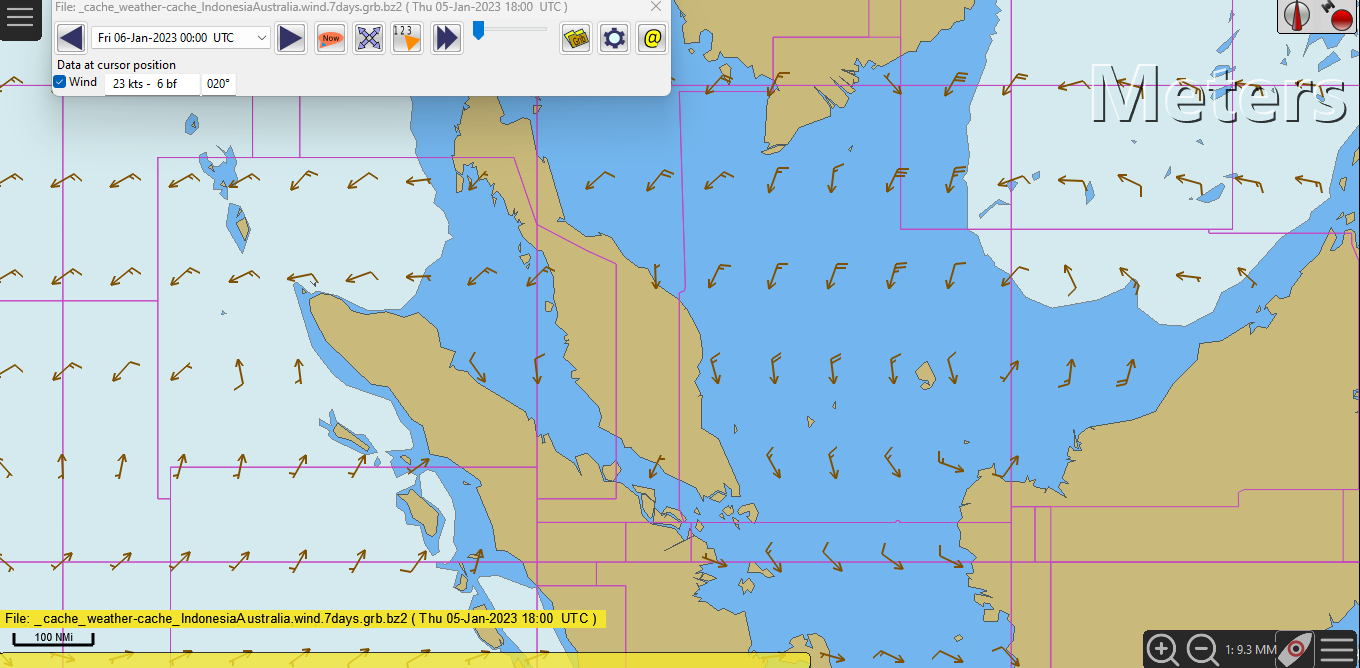 |
| GRIB file display in OpenCPN data, several sources for download available online. |
We have a SailMail account and with it comes access to the Saildocs GRIB repository. We can access this via the internet, HF radio with practor modem or via a satellite phone. We can display the files through the SailMail Airmail program, OpenCPN or zyGRIB programs. We do like using OpenCPN on the PC and zyGRIB on the Raspberry to display the GRIBS due to the fact we can display using local time, we don’t have to continually convert UTC to local which can become tiresome.
I have mentioned these programs that download files due to the fact mobile phone apps while pretty and contain a lot of data unfortunately are not much good once you are out of range of the phone towers. Look for mobile phone applications that allow the downloading of GRIBS for display at a later time. While I don’t use this myself I have seen and liked the look of Predict Wind Offshore, a download before a passage allows the data to be available for display later.
Whatever you use, think about data usage when away from the more populated towns. I do know the GRIBS we download have been optimised for data use and transmission over slow internet connections, and in some remote villages we did just that. While friends we were travelling with could not get any GRIBS downloaded on to their tablets or mobile phones in areas of limited internet connections.
To sum up.
Last but very very important, zoom in your chartplotter, I have lost count of the number of times have I heard "we ran onto an unmarked rock/reef/obstruction that was not charted" in most cases, not all, the reality is that "it" was charted however it was not visible in the layer of zoom the chartplotter was in. Experiment with zoom levels and check it out for yourself.
Declutter your screen when needed
Some thing you may want to do from time to time is declutter your chart display when it becomes cluttered with detail. We have seen areas where there have been so much text and detail on the chart it actually becomes confusing. A quick way to do this is with hotkeys, make your self a cheat sheet so its at your finger tips. Link to a short hotkey description.
Remember a reasonably good GPS receiver will give positions <15 metres 95% of the time. Some of the newer GNSS units can do better but remember the chart you’re using may not be as accurate as the GPS/GNSS unit.
If you want to run two programs that require a GPS and only have one GPS feed/dongle you can install software (GpsGate) that makes the GPS input available to two or more programs at once. For example, Google Earth and SAS Planet at the same time.
Both Google Earth and SAS Planet can collect and store satellite imagery in a user selectable pre-set storage size cache. This imagery can be used when there is no internet connection later during the passage. This Google Earth data cannot be permanently saved, the cache will be over written when next on line and Google Earth is started. However, I believe a copy of the SAS Planet cache data can be made, worthwhile to fall back upon if the cache is over written.
A program called GERoute has been created to automate the process of collecting Google Earth satellite imagery into the Google Earth cache.
From the same programmer is GE2KAP and now the latest version SAT2CHART, this program is used to create your own geo referenced satellite imagery (.KAP and .Mbtiles files/charts) for use in the chart repository of OpenCPN. These files can be stored, backed up and shared with other cruisers. A better option than saving to cache.
OpenCPN is a concise and robust open source chart plotting software. OpenCPN plugins are available to display the vessel in real time on both the electronic chart and Google Earth satellite imagery without the need for additional GPS connections to the computer. The display of Google Earth satellite imagery with the plugin can be from cache or live through an internet connection. Using this option you will not need to install GpsGate as the vessel position is displayed on the Google Earth satellite images using the single GPS connection used to position the vessel in OpenCPN.
During passage planning another reason to scan over the charts is to get an idea of what’s out there. Once you have an idea of the path, zoom in the electronic chart for maximum detail and follow your route. It’s amazing the number of times we have heard of people hitting a reef/submerged object, all because they were not using a low enough zoom level and missed seeing the object they collided with.
Last but not least, sometimes you will not get a good satellite image to use. Look through the Historical Imagery to check all the previous images. Select different image providers. We have seen the sun reflection on the water masks detail, the same can be said about clouds covering the area. Most providers mix and match sections of the photos looking for a clear image and sometimes it just doesn’t happen. Luckily this doesn’t happen often but be aware of the problem, and search areas close by.
Additional resources
Some cruisers write blogs and upload cruising information to websites. We spend time going through these resources before cruising off. But you need to look at the recent blogs, please keep in mind things change, sometimes overnight, as an example, an earth quake can change the sea floor in a flash. As I mentioned earlier, if you find the anchorages given in a blog don’t live up to the description then it might be time to disregard information from the source. Last but not least some cruising guides (even expensive ones) do get it wrong, be careful and do your homework.
We have had to spend a lot of time working through others information to find out what was/is factual. It is like a lot of information these days, the data is not recorded correctly, speculation or opinion rather than fact is recorded.
OpenCPN chart plotter https://opencpn.org/
Google Earth OpenCPN plugin https://opencpn.org/OpenCPN/plugins/googleearth.htm
GpsGate http://www.tiki-navigator.com/English/Franson_GpsGate.htm
GERoute SAT2CHART and SASplanet http://www.gdayii.ca/Downloads.php
WXTIDE32 http://wxtide32.com/
Sources of shared Google Earth KAP files, Routes and Tracks:
http://hackingfamily.com/Cruise_Info/Equipment/Equipment.htm
http://yachtzenagain.blogspot.com.au/2015/04/googleearth-kap-library-for-opencpn-and.html
Google Earth:
Do not install the latest version. Google has removed the API that the OpenCPN plugin and GE2KAP, SAT2CHART and GERoute depends on. This bundle Google Earth Pro_7.3.1.45 works available for download from google. Oh, and once installed don’t hit the update key when the program opens the first and subsequent times. Then if you run chrome browser it will want to update google earth, I disable this function. How too can be found on line.
And the best bit is the software listed above is free, however if you make good use of any that are not a commercial venture please donate to keep the wheels turning.